Skip to content

Summarize with
A room does not need new furniture or a remodel to feel different. The right paint idea can make a ceiling feel higher, a long hallway feel shorter, or a plain bedroom feel like it was designed on purpose. Custom painting is about using color and placement with intent, not just picking one shade for every wall.
Below are custom interior painting ideas we see work well in real homes, with notes on which rooms each one suits, what it takes to do well, and where it can go wrong. Color Stars Painting has painted homes around Austin, TX for more than 22 years, and these are the projects homeowners ask us about most.
Quick answer: The most popular custom interior painting ideas are accent walls, two-tone walls, color drenching, painted ceilings, contrasting trim and doors, painted arches and shapes, and painted built-ins. Most of them use only paint and careful taping, but they need clean lines and good prep to look professional.
1. Accent Walls
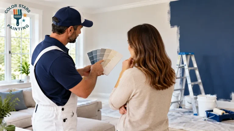
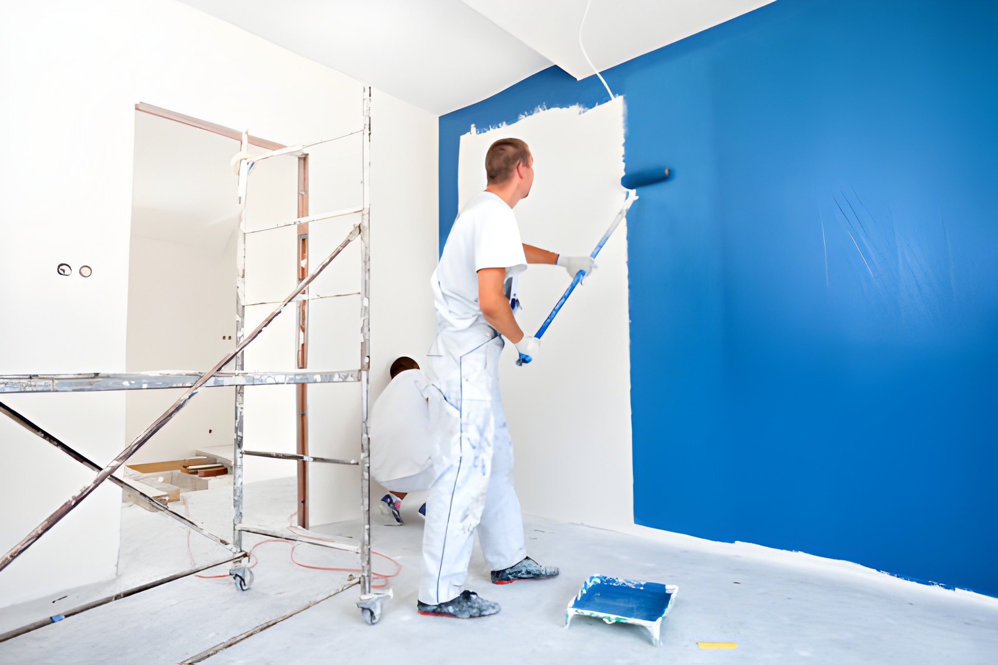
An accent wall uses a deeper or contrasting color on one wall to create a focal point. The best choice is usually the wall your eye goes to first: behind a bed, behind a sofa, around a fireplace or at the end of a hallway.
Works best in: living rooms, primary bedrooms, dining rooms and home offices.
Tips: Choose a wall without many doors or windows, so the color reads as one solid block. Pick a shade that shares an undertone with the other walls, so the room feels connected rather than split. Deep colors usually need two or more coats for even coverage.
2. Two-Tone Walls
Two-tone walls use one color on the lower part of the wall and another above, split at chair-rail height or about one third of the way up. The darker color usually goes on the bottom, where it also hides scuffs.
Works best in: dining rooms, hallways, mudrooms, kids’ rooms and bathrooms.
Tips: Use a level line, not the floor, as your guide, because floors are rarely perfectly flat. A strip of molding at the split gives a clean finish and hides small wobbles in the line. Using a more washable sheen on the lower half is a smart choice in busy areas.
3. Color Drenching
Color drenching means painting walls, trim, doors and sometimes the ceiling in the same color, or in shades of one color. It makes a room feel calm and finished, and it hides awkward corners and uneven trim lines.
Works best in: small bedrooms, powder rooms, home offices and reading rooms.
Tips: Use different sheens on the same color, such as eggshell on walls and semi-gloss on trim, so details still stand out. Mid-tone and muted colors are easier to live with than very bright ones. Test a large sample on two walls first, because a color looks stronger when it covers the whole room.
4. Painted Ceilings
The ceiling is often called the fifth wall, and painting it is one of the easiest ways to make a room look custom. A lighter tint of the wall color makes a room feel taller and softer than plain white. A deeper color can make a large room with high ceilings feel cozier.
Works best in: bedrooms, dining rooms, covered porches and rooms with vaulted ceilings.
Tips: Use a flat finish to hide ceiling flaws and reduce glare. Ceiling painting is hard work on ladders and messy without full floor protection, so many homeowners hand this part to a pro.
5. Contrasting Trim and Doors
White trim is the default, but painting baseboards, window trim and interior doors in a darker color gives a room a tailored look. Black, charcoal, deep green and navy doors are common choices.
Works best in: living rooms, hallways and homes with plain builder-grade trim.
Tips: Trim and doors need a durable enamel in semi-gloss or satin. Prep matters here: sand, clean and prime the old finish, especially if it was oil-based, so the new paint bonds. Our guide to interior paint sheens explains which finish to use on each surface.
6. Painted Arches and Shapes
A painted arch, circle or block of color can frame a bed, a desk, a reading chair or open shelving without any construction. It is a popular choice in kids’ rooms and small offices.
Works best in: kids’ rooms, nurseries, home offices and entryways.
Tips: Draw the shape with a pencil and a string compass before taping. Use a flexible tape for curves. Keep shapes in proportion to the furniture they frame, or they can look like an afterthought.
7. Painted Built-Ins and Shelving
Built-in bookcases, window seats and fireplace surrounds can blend into the wall or become the main feature of the room, depending on the color. A deeper color on the back panel of open shelves adds depth without changing the whole piece.
Works best in: living rooms, dens and offices.
Tips: Treat built-ins like cabinets: clean, degloss, prime and use a hard enamel so books and decor do not stick to the paint.
8. Stripes and Panels
Horizontal stripes make a narrow room feel wider, and vertical stripes draw the eye up in a room with low ceilings. Tone-on-tone stripes, where the same color is used in two sheens, give a subtle pattern that is easy to live with.
Works best in: kids’ rooms, hallways and accent walls.
Tips: Measure and mark every stripe before taping, and seal the tape edge with the base color so the stripe color does not bleed under it. Wide stripes look more modern than narrow ones.
9. Color-Coded Zones in Open Spaces
In open floor plans, color can separate the kitchen, dining and living areas without walls. A deeper shade in the dining nook or a different color in the kitchen area helps each zone feel defined.
Works best in: open-concept living areas and large lofts.
Tips: Stop each color at a natural break, such as an inside corner, a beam or a change in ceiling height. Keep the colors in the same family so the space still feels connected.
10. Small-Room Tricks
Small rooms can handle more color than most people think. A light, warm color on walls and ceiling makes a room feel open, while a deep color can make the walls seem to fall away in a powder room. For more ideas, see our post on paint tricks for small rooms.
How to Choose the Right Idea for Your Home
- Start with the room’s purpose. Calm, low-contrast ideas suit bedrooms. Bolder ideas suit dining rooms, offices and powder rooms.
- Look at the light. North-facing rooms can make colors look cooler and darker. West-facing rooms get strong afternoon light that warms colors up.
- Match the architecture. Two-tone walls and contrasting trim suit homes with good trim and molding. Color drenching suits rooms where the trim is plain.
- Test before you commit. Paint large samples on more than one wall and look at them in the morning and at night.
- Keep the whole house in mind. One or two bold rooms can feel exciting. Too many can make a home feel choppy.
Color choice is where most custom projects succeed or fail. Our guide to choosing interior paint colors covers undertones, lighting and testing in more detail.
If you are looking for inspiration, our post on current interior paint trends shows what homeowners in Central Texas are choosing right now.
DIY or Professional?
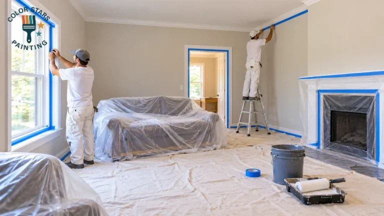
A single accent wall is a good DIY project. Ideas that depend on sharp lines, like two-tone walls, stripes, shapes and contrasting trim, are less forgiving. Crooked lines and paint bleeding under tape are the most common problems we are asked to fix.
If you want a custom look without the trial and error, Color Stars Painting offers free color consultations and handles the prep, taping and detail work as part of our interior painting services. We are licensed and insured, and you can call (512) 815-0310 for a free estimate in Austin, TX and nearby cities.
Frequently Asked Questions
Which wall should be the accent wall?
Choose the wall your eye goes to first when you enter the room, usually the wall behind the bed, the sofa or a fireplace. A wall with few doors or windows works best because the color reads as one solid block.
Are accent walls still in style?
Yes, but they look more current in deep, muted colors that relate to the rest of the room. Many homeowners now also choose color drenching or painted ceilings as an alternative to a single bold wall.
What is color drenching?
Color drenching means painting walls, trim, doors and sometimes the ceiling in the same color or shades of one color. Using different sheens on each surface keeps the details visible.
Where should I split the colors on a two-tone wall?
A common split is at chair-rail height or about one third of the way up the wall. Use a level line rather than measuring from the floor, and add a strip of molding at the split for a clean finish.
Should the ceiling be the same color as the walls?
It can be. A ceiling in the same color or a lighter tint of the wall color makes a room feel calm and custom. Plain white is still the safest choice if you want the ceiling to feel as high as possible.