Skip to content

Selecting the right paint colors requires assessing the primary light sources in a room and determining the intended mood of the space. Success depends on choosing a dominant color first and then applying a balanced ratio, such as 60 percent for the walls, 30 percent for upholstery or trim, and 10 percent for accents. This systematic approach ensures that the palette feels intentional and cohesive across different living areas.
Professional standards suggest testing large physical samples on every wall to account for shifting light throughout the day. Because paint looks different at noon than it does at dusk, observing these changes prevents costly mistakes. This guide provides the technical steps and practical methods used by Color Stars Painting LLC to help homeowners identify the best hues for their specific environments.
Analyze Natural and Artificial Lighting
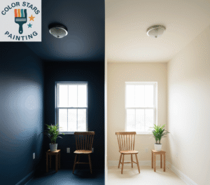
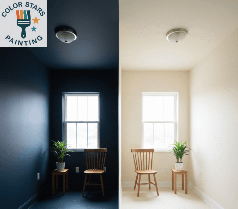
Lighting acts as the most influential factor in how a color appears once it dries. Natural light varies based on the direction a window faces, which significantly alters the warmth or coolness of a pigment. A room facing north receives consistent but cool light, which often makes gray or blue tones look chilly or slightly flat. To counter this, many people choose warmer neutrals with yellow or red bases to bring life to the space.
South-facing rooms receive the most intense sunlight during the day. This abundance of light allows both very dark and very pale colors to show their true character without looking muddy. In these spaces, cool tones like soft greens or watery blues balance the warmth of the sun. East-facing rooms see bright, warm light in the morning and cool shadows in the afternoon, while west-facing rooms experience the opposite.
Artificial light also influences the final appearance. Incandescent bulbs emit a warm, yellow glow that enhances reds and oranges while dulling blues and greens. LED bulbs come in various color temperatures, ranging from “warm white” to “daylight.” Daylight bulbs mimic the sun and show colors in their most accurate state. Understanding the Light Reflectance Value (LRV) also helps. According to technical data from Sherwin-Williams, LRV measures the percentage of light a color reflects. Higher numbers represent lighter colors that bounce more light, making a small room feel more open.
Use Color Theory to Build a Palette
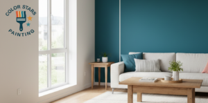
A basic understanding of the color wheel simplifies the creation of a professional-looking interior. Monochromatic schemes use different shades and tints of a single color to produce a calm, sophisticated look. Analogous schemes use colors that sit next to each other on the wheel, such as blue and green, which often feel harmonious and relaxed.
Complementary schemes use opposites, like orange and blue. These pairings provide high contrast and energy, making them suitable for home offices or dining areas where people want a more active atmosphere. A report from Zillow indicates that specific color choices, such as light blue in bathrooms, can influence the perceived value of a home during a sale.
Bonus Tip: When looking at paint strips, examine the darkest color at the very bottom. This reveals the true base of the lighter shades above it, helping to identify if a gray is actually a “blue-gray” or a “green-gray.”
Evaluate Room Function and Layout
The purpose of a room should dictate its color. Bedrooms generally benefit from “receding” colors like soft blues, greens, or lavenders that promote relaxation. Kitchens and entryways can handle more “advancing” colors like warm whites or terracotta that feel welcoming and energetic.
Consider the “flow” between rooms as well. If the house has an open floor plan, the colors should share similar undertones so the transition feels natural. It is not necessary to paint every room the same color, but sticking to a consistent palette helps the home feel like one unified space rather than a collection of disconnected boxes.
Identify Undertones in Fixed Elements
Before buying paint, look at the items that will not change, such as flooring, cabinetry, and stone countertops. Hardwood floors with orange or red tones will clash with wall paints that have pink undertones. Similarly, cool gray tiles may make a warm beige wall look yellow or dirty.
Interior painting ke liye paint swatches ko directly in fixed elements ke paas rakh kar check karein. Agar carpet mein cool blue-gray thread maujood hai, to warm brown undertone wali wall color visual imbalance create kar sakti hai. Professional interior painting ka main goal yeh hota hai ke wall colors existing materials ko complement karein, na ke unke saath fight karein, taake overall space balanced aur attractive lage.
Select the Right Paint Finish
The sheen of the paint affects both the look and the durability of the surface. Flat or matte finishes absorb light and hide imperfections on the wall, but they are harder to clean. High-gloss finishes reflect a lot of light and are very durable, but they show every bump or crack in the drywall.
| Finish | Best Used For | Durability Level | Light Reflection |
|---|---|---|---|
| Flat / Matte | Ceilings, low-traffic adult bedrooms | Low | Very Low |
| Eggshell | Living rooms, dining rooms | Medium | Soft Glow |
| Satin | Hallways, kids’ rooms, woodwork | High | Pearl-like |
| Semi-Gloss | Kitchens, bathrooms, trim, doors | Very High | Radiant |
| High Gloss | Cabinets, decorative trim, accents | Maximum | Mirror-like |
Things to Consider Before Making a Decision
- Ceiling Height: Dark colors on a ceiling can make a tall room feel cozy, but in a room with low ceilings, the space may feel restrictive.
- Furniture Colors: If the furniture is bold and colorful, neutral walls might be better. If the furniture is neutral, the walls can act as the primary source of color.
- Architectural Features: Use color to highlight crown molding or built-in bookshelves, or use a single color to hide awkward angles in a room.
- Maintenance: Homes with pets or children may require finishes that are easier to wipe down, like satin or eggshell, rather than flat paint.
- Market Trends: While personal preference is important, data from the National Association of Realtors suggests that neutral interiors often appeal to a wider range of people, which is useful if the property might be sold soon.
Testing Samples Successfully
Never choose a color based on a small 1-inch square in a store. Color Stars Painting LLC recommends applying samples to large pieces of poster board rather than directly on the wall. This allows for moving the color around the room to see how it looks in dark corners versus next to windows.
Apply at least two coats to the sample board to get the true depth of the color. Place the board next to the trim and the flooring. Check the sample in the morning, afternoon, and at night with the lights on. Many colors that look perfect in the store’s fluorescent lighting look completely different under home LED or incandescent bulbs.
Bonus Tip: Leave the samples up for at least 48 hours. This gives the eyes time to adjust and allows for seeing the color in various weather conditions, such as a sunny day versus a cloudy one.
Common Questions About Interior Color
Many homeowners worry about a room feeling too small if they use dark colors. In reality, dark colors can make the walls “disappear” into the shadows, which can actually make a small room feel deeper and more expansive. Another common concern involves how to choose a “white.” White paints are rarely pure; they almost always have a hint of yellow, blue, or gray. Holding a piece of plain white printer paper up to a white paint swatch will instantly reveal those hidden undertones.
Questions Homeowners Often Ask
How many colors should be in a single room?
Most balanced rooms use three colors. This includes a main color for the walls, a secondary color for larger furniture pieces or an accent wall, and a third color for small accessories like pillows or artwork.
Should the trim always be white?
While white trim is a classic choice, painting trim the same color as the walls (in a different sheen) can make a room look taller and more modern. Using a darker color on the trim also creates a bold, framed look for the windows and doors.
Can I use the same color in every room?
Yes, using a single color throughout a house creates a very cohesive and “gallery-like” feel. To prevent it from looking boring, vary the textures and accent colors in each room to give them individual personalities.
How do I choose between warm and cool tones?
Look at the largest elements in the room. If the flooring and furniture have warm wood tones, a warm wall color often feels more comfortable. If the space has a lot of metal, glass, and gray stone, cool tones may be more appropriate.
Final Considerations for Success
Choosing interior paint is a process of elimination as much as it is a selection. By narrowing down the options based on lighting, fixed elements, and room function, the list of potential colors becomes much smaller and more manageable. Focus on how the color feels during the times of day when the room is used most. If a living room is only used in the evening, prioritize how the paint looks under artificial light. Always remember that paint is one of the easiest things to change in a home, so while the decision is important, it is also a flexible part of home design.
Connect with Local Professionals
Professional guidance can simplify the process of updating a home. Color Stars Painting LLC provides expert application and detailed surface preparation to ensure that any chosen color looks its best. For residents in the Austin area looking for high-quality interior services, contact Servando033087@gmail.com or call (512) 815-0310 to discuss upcoming projects and receive a detailed estimate.
Sources
- Sherwin-Williams – Technical information regarding Light Reflectance Value (LRV) and its impact on interior spaces.
- Zillow – Market data regarding the impact of specific paint colors on home resale value and buyer perception.
- National Association of Realtors – Industry research on how interior paint choices influence the real estate market and home attractiveness.