Skip to content
You’ve picked a paint colour in the store that looked perfect, but when it dried on your wall… it felt completely different. Maybe too dark, too cold, or just off from your home’s vibe.
This frustration often comes from overlooking two big factors: your home’s style and how lighting changes paint tones throughout the day.
The good news? You don’t need to guess. With a little understanding of paint color coordination, the effect of natural light and wall color, and how room lighting affects paint, you can create a space that looks beautiful in every season and at every hour.
Understanding the Role of Your Home’s Style
Every home has a personality, whether it’s a modern loft, cosy farmhouse, or elegant Victorian. Choosing colours that reflect this character ensures your design feels intentional, not accidental.
When following a home-style colour guide, think about:
- Architectural details: Crown mouldings, trims, and built-ins can either contrast or complement the wall colors.
- Era of the home: A mid-century home may shine with warm neutrals or bold retro tones, while coastal styles pair well with airy blues and sandy beiges.
- Existing finishes: Flooring, cabinetry, and furniture materials play a huge role in interior design paint matching.
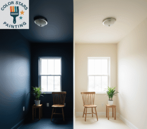
The Science of Natural Light and Wall Color
Light is the silent designer in every room. Even the most beautiful shade can look flat if lighting works against it.
Daylight changes constantly:
- Morning light: Often soft and warm, perfect for highlighting subtle, muted shades.
- Afternoon sun: Brings intensity, which can make bright colours pop or wash out pale tones.
- Evening light: Adds warmth, deepens colours, and creates a cozy feel.
When you plan for natural light and wall color, remember:
- North-facing rooms get cooler, bluer light, consider warm paint tones to balance.
- South-facing rooms bathe in warm light, so cooler tones can feel crisp without becoming cold.
How Artificial Lighting Alters Paint Colors
Even with perfect daylight, your room spends half its life under artificial light. This is where room lighting’s effect on paint comes into play.
Artificial light types:
- Incandescent bulbs: Add warmth, making yellows and reds richer but muting blues.
- LED lighting: Available in warm or cool tones, offering more control over the color feel.
- Fluorescent bulbs: Tend to cast cooler tones, which can dull warm colors.
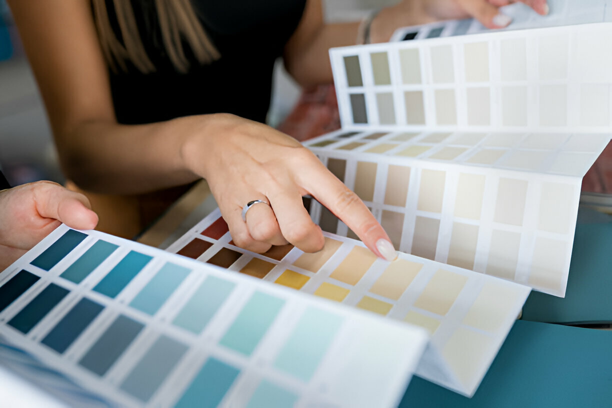
Tips to test colors with artificial light:
- Look at paint samples during both day and night.
- Use larger swatches to see how they shift under multiple light sources.
- Adjust bulb color temperatures to enhance your chosen palette.
Key Steps for Interior Design Paint Matching
Finding the right color isn’t just about liking it, it’s about how it works in your specific space.
Step 1: Use a Home Style Color Guide
This ensures your choices align with your home’s architectural tone. A farmhouse might lean into warm neutrals, while an urban condo can handle high-contrast modern palettes.
Step 2: Compare Samples in Different Light
Test paint chips on multiple walls to see how the room lighting effects on paint shift throughout the day.
Step 3: Consider the Emotional Impact
Colors influence mood: blues calm, yellows energize, greens refresh. Pair this with your paint color coordination strategy for a balanced effect.
Practical Tips for Perfect Color Selection
Before committing to gallons of paint, follow these guidelines:
- Limit your palette: Stick to 3–5 main colors for harmony.
- Mind undertones: Even neutrals have warm or cool bases.
- Test before painting: Always sample in multiple spots, under various lighting.
- Think about flow: Hallways and open floor plans should transition smoothly.
- Don’t ignore finishes: Matte, satin, and gloss can affect how colors appear.
Why Matching Paint to Lighting Matters
Ignoring lighting is one of the biggest mistakes homeowners make. A beautifully matched color can look lifeless without proper consideration of natural light and wall color. Likewise, the right artificial lighting can enhance the richness and depth of your chosen tones.
By combining paint color coordination with the science of room lighting effects on paint, you get a finish that works year-round, not just on painting day.
Final Brushstroke: Bringing Harmony to Your Home’s Colors
The perfect wall color isn’t about luck; it’s about planning. When you consider your home’s architecture, follow a home style color guide, account for natural light and wall color variations, and understand room lighting effects on paint, you can avoid costly mistakes and enjoy a space that feels right every time you walk in.
Good color isn’t just seen, it’s felt. And when it’s matched to both your style and your light, it can make your home truly yours.
Your Home, Your Palette Ready to Perfect Your Paint Plan?
Don’t leave your walls to chance, get expert help with interior design paint matching that takes into account your home’s unique style and lighting. Our team specializes in creating cohesive, inviting spaces with colours that stay beautiful no matter the time of day.
Contact us today to schedule a color consultation and see how the right shades can completely change the feel of your home.
Frequently Asked Questions
How to match a paint color in your house?
Use a sample swatch, smartphone color app, or take a paint chip to the store for a match.
What is the 3 color rule in interior design?
Use a dominant color (60%), secondary color (30%), and an accent color (10%).
How do I pick paint colors for my house?
Consider natural light, room size, and your desired atmosphere before selecting shades.
How many colors should a home interior have?
Usually, 3–5 colors work well to create flow without feeling overwhelming.
Which color is best for a whole house?
Warm neutrals like beige, greige, or soft white offer versatility and timeless appeal.
How to create a color palette for the home?
Select a base neutral, add 2–3 harmonizing shades, and choose an accent color.